Ampersand Spoon-Set
The Ampersand Spoon Set entwines the topics of role multiplicity and typography. When joined together and viewed from a certain angle the two curved spoons form an ampersand archetype (&).
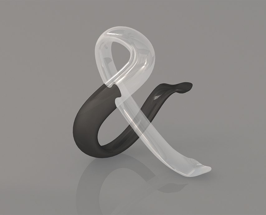
To serve this function, each spoon cannot be without the other – emphasizing the and-meaning behind the typographic mark. Each spoon has its own material markup in order to highlight their individuality from each other and thus creating an interesting tension between them.
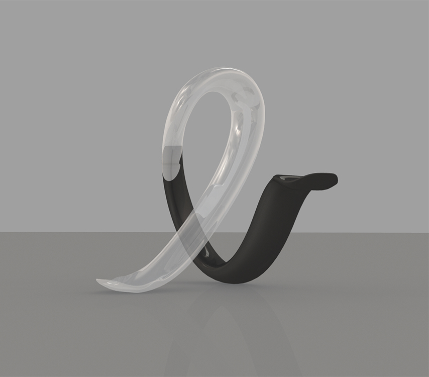
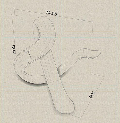
The fabricated version turned out fairly well, and it was a pleasant surprise that the combined form is balanced enough so it can be made to stand upright – albeit with some patience required of the user. A horizontal 1mm sanding from the bottom of the U-shaped spoon might help stabilize it, along with some further work focused on the join itself.
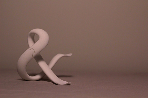
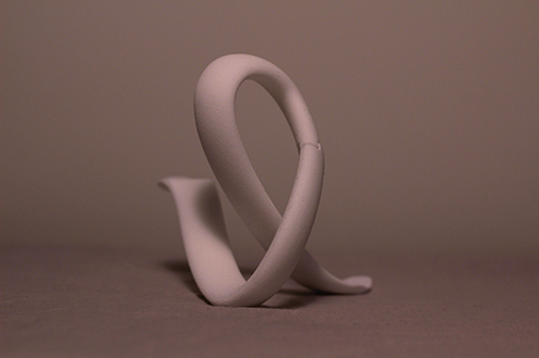
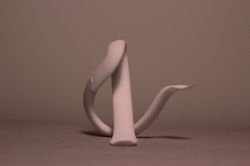
Early sketches revolved around exploring multiple functionalities of an object based on its form seen from various viewpoints. This was primarily done to tie in role-multiplicity and study the application of it in a material object. As I was more familiar with designing from a single viewpoint it helped to “sketch” in a 3-dimensional material (clay) and feeling my way around overlaps and multiple angles.
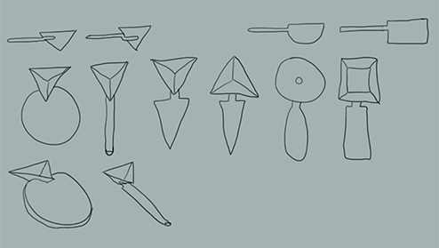
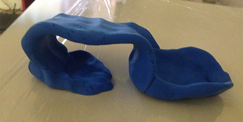
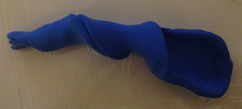
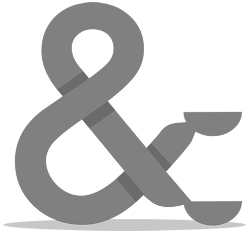
While the multiplicity angle was necessary, the sketches felt a bit too vague and the overall shape was eluding me. Through trial and error I ended up with tying in my appreciation of typography and how the the meaning and aesthetics of an ampersand corresponds well with the topic of multiplicity.
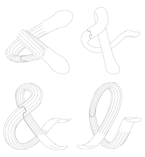
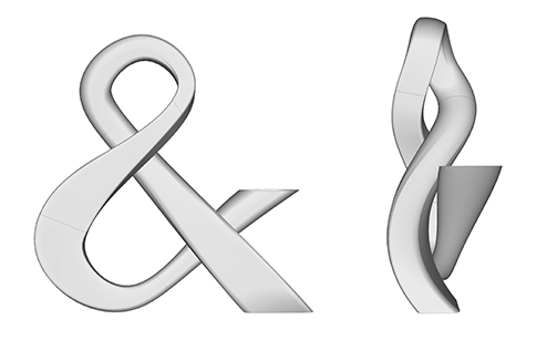
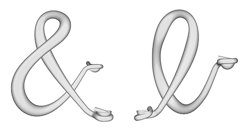
As I was familiarizing myself with the Rhino software, I experimented with the ampersand-form and how overlaps can work differently from different angles.
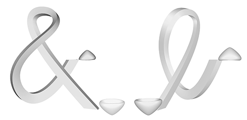
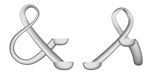
Ultimately, I ended up smoothing out the underlying structure to have the form be more stable, continous and elegant. The oval-like volume introduced to the fundamental form adds thick-and-thin tension which the uniform aesthetic was lacking. The spoon “heads” and joins were also simplified and streamlined to fit the overall shape.
